Best Neutral and Earth Tone Bag Colors for 2026 Collections
Which neutral and earth tone bag colours should a 2026 collection carry? Four carry the volume — oat, clay, espresso and olive — and the deciding factor is not taste but measurability: a colour that can be matched to a Pantone TCX reference at Delta E 2.0 or better, repeated across a dye lot and held across a second run. The expensive colour in a collection is never the pigment; it is the second dye lot that does not match the first. This comparison matrix puts the four families side by side on light fastness, crocking, hardware pairing and the plating colours that flatter each one.
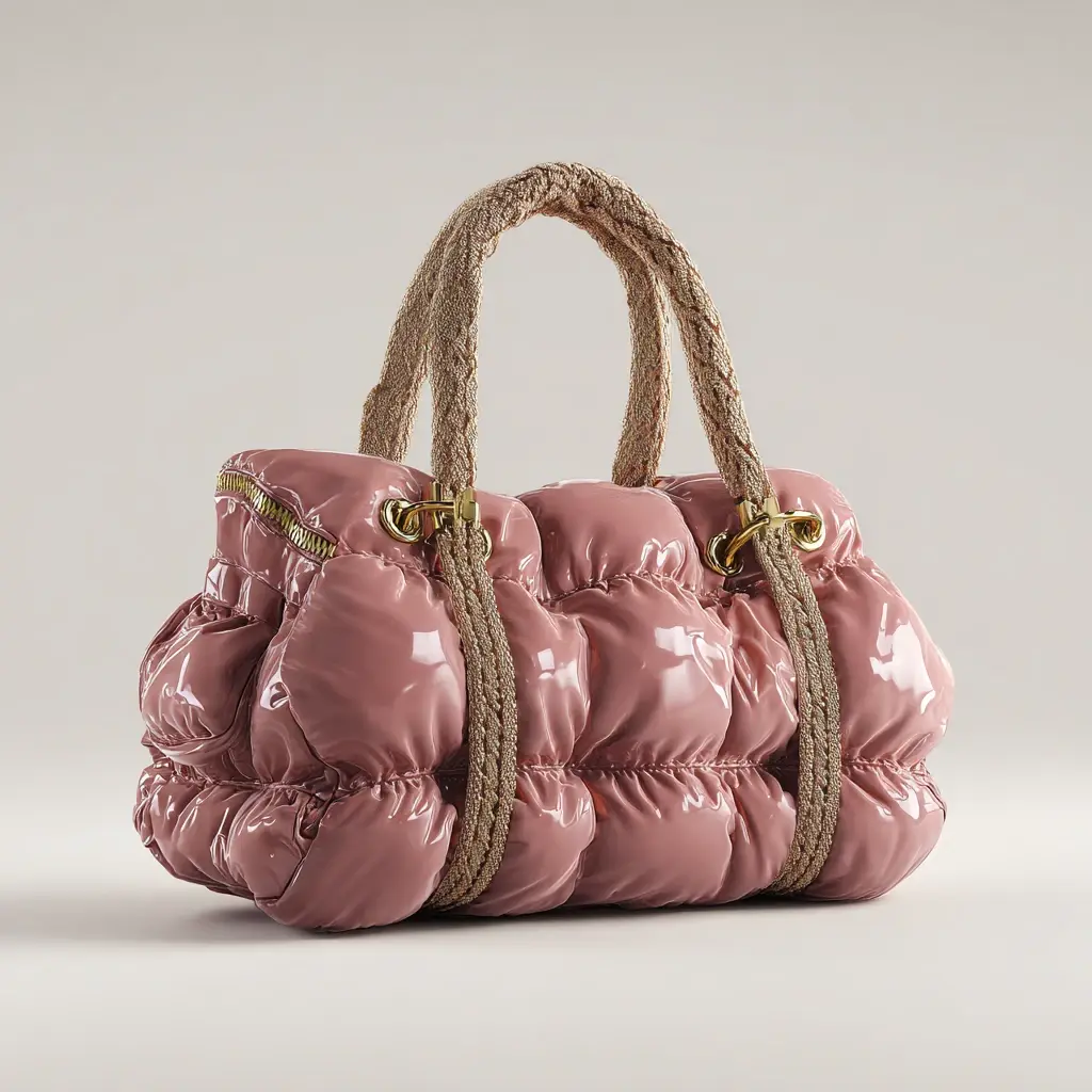
- The Four Families and Where Each One Sells
- Neutral Versus Earth Tone Versus Accent
- Pantone Reference, Delta E and the Tolerance That Holds
- Colourfastness Tests a 2026 Collection Should Pass
- Dye Lot Reality at 500 Pieces Per Colourway
- Plating Colours That Flatter Each Family
- Building a Five-Colour Capsule for 2026
- Briefing Colour So the Sample Matches the Run
- Trims Decide Whether a Neutral Holds Together
- How Each Family Ages Across a Season
Which neutral and earth tone bag colours should a 2026 collection carry? Four carry the volume — oat, clay, espresso and olive — and the deciding factor is not taste but measurability: a colour that can be matched to a Pantone TCX reference at Delta E 2.0 or better, repeated across a dye lot and held across a second run. The expensive colour in a collection is never the pigment; it is the second dye lot that does not match the first. This comparison matrix puts the four families side by side on light fastness, crocking, hardware pairing and the plating colours that flatter each one.
What a neutral programme has to hold
The Four Families and Where Each One Sells
Neutrals and earth tones are not one decision. They split into four families with different selling behaviour, different risk and different photography requirements, and a collection that carries one from each family reads as considered while a collection that carries four shades of beige reads as undecided. The table below is the short form used when a buyer asks for a colour plan before a brief exists.
| Family | Representative reference | Sells hardest in | Principal risk |
|---|---|---|---|
| Oat and bone | Pantone TCX 11-0105 and near matches | Resort, bridal-adjacent, gifting | Soiling in transit and in store handling |
| Clay and terracotta | Pantone TCX 16-1330 and near matches | Autumn drops, social commerce | Batch drift on coated fabric |
| Espresso and chocolate | Pantone TCX 19-1216 and near matches | Work and commuter categories | Masks embossing and stitch detail |
| Olive and moss | Pantone TCX 18-0416 and near matches | Outdoor-adjacent, unisex lines | Reads grey under cool retail lighting |
Two families behave differently enough to be worth a note. Oat and bone sell beautifully and arrive badly: a pale lining and pale exterior show every handling mark, which is why oat collections are specified with a 190T or 68 gsm lining in a mid-tone rather than a matching pale one, and shipped with a dust bag as standard rather than as an option. Espresso has the opposite problem in reverse — it hides soiling and hides branding, so an espresso programme should be embossed deeper, at 0.6-0.9 mm of die depth rather than the 0.3-0.5 mm that reads correctly on oat.
Neutral Versus Earth Tone Versus Accent
Most first collections over-weight accent colours because accents photograph well and neutrals photograph predictably. The correction is a ratio rather than a rule: three neutrals or earth tones to one accent, with the accent carried on a trim, a lining or a single small silhouette rather than across the whole line. That ratio keeps the dye-lot count down, keeps the 500 pcs per colourway minimum working in the brand's favour, and still gives the listing a colour that stops the scroll.
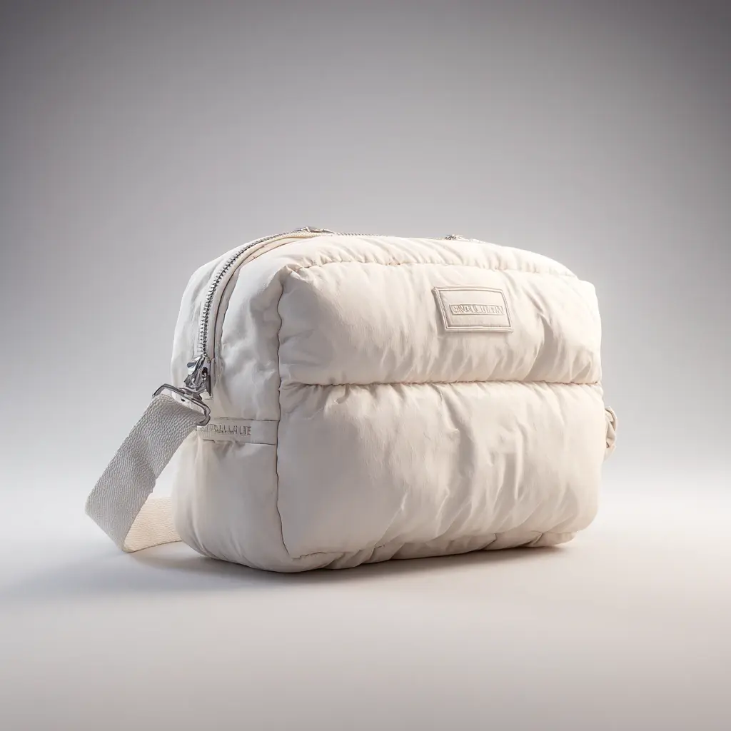
| Decision | Neutral (oat, bone, grey) | Earth tone (clay, olive, espresso) | Accent (oxblood, cobalt, emerald) |
|---|---|---|---|
| Share of a first line | 40-50 percent | 40-50 percent | 10-15 percent |
| Colour match difficulty | Moderate; drift shows as yellowing | Moderate; drift shows as red or green cast | High; saturated shades drift fastest |
| Light fastness exposure | Yellowing risk on pale finishes | Fading risk on vegetable-tanned hides | Fading risk highest across the group |
| Returns profile | Soiling complaints | Shade-versus-screen complaints | Impulse buys with the highest return rate |
| Repeat-order behaviour | Reordered steadily across seasons | Reordered with a seasonal peak | Rarely reordered in the same shade |
| Photography requirement | Needs a grey card and fixed white balance | Needs warm neutral lighting | Needs careful saturation control |
Read the matrix as a risk allocation rather than as a taste ranking. Neutrals generate soiling complaints, which are preventable with a mid-tone lining and a dust bag. Earth tones generate shade-versus-screen complaints, which are preventable by shooting against a physical swatch rather than against memory. Accents generate impulse returns, which are not preventable at all and are the reason the accent share stays small.
Pantone Reference, Delta E and the Tolerance That Holds
A named colour is not a specification. Oat is a mood; Pantone TCX 11-0105 with a Delta E tolerance of 2.0 or better measured under a D65 light source against an approved physical swatch is a specification. Delta E is the distance between two colours in CIELAB space, and the practical bands are these: under 1.0 is invisible to most eyes, 1.0 to 2.0 is invisible under retail lighting, 2.0 to 3.5 is visible when two pieces are set side by side, and above 3.5 is a complaint. Writing 2.0 into the purchase order is what turns a colour argument into a measurement.
- Name the reference standard. Pantone TCX for fabric and coated material, a physical approved swatch for leather, because leather finish changes perceived shade more than the dye does.
- Name the light source. D65 for daylight assessment, and the store lighting specification where the bag will be sold, because olive under 4000K LED is a different colour from olive under daylight.
- Name the tolerance and the instrument. Delta E 2.0 or better, measured on a spectrophotometer, on three points of the panel rather than one.
- Name the gloss window. 8-12 gloss units at 60 degrees for coated trim; outside that window a correct colour still looks wrong because the surface reflects differently.
- Retain the approved swatch. Two signed pieces, one kept with the specification and one with the material store, is what makes the second run match the first.
One nuance worth pricing in. A tolerance of Delta E 1.0 instead of 2.0 roughly doubles the shade-matching time on a dye lot and is only worth specifying where the bag will be sold next to another bag from the same line — a capsule, a gift set, a coordinated three-piece programme. For a single silhouette in one colourway, 2.0 is the correct commercial choice and 1.0 is money spent on a difference nobody will see.
Colourfastness Tests a 2026 Collection Should Pass
Colour that matches on the day it is made and drifts in six months is a warranty problem rather than a design problem. Three tests cover the exposure a handbag actually meets, and all three should be written into the specification with a minimum grade rather than left to a material datasheet.
- Light fastness, ISO 105-B02. Grade 4 minimum after xenon-arc exposure. Below grade 4, a bag sitting in a window display or a sunlit listing photograph will shift within one season, and the shift is uneven across panels.
- Rubbing or crocking, ISO 105-X12. Grade 4-5 dry and 3-4 wet. Pale linings against dark exteriors are where wet crocking fails first, which is why a dark espresso bag with an oat lining is a specification worth testing twice.
- Perspiration, ISO 105-E04. Grade 4 where the bag meets skin for hours — a crossbody strap, a shoulder strap in summer, a handle carried in a bare hand.
- Chemistry, REACH Annex XVII. Azo dyes and chromium VI restrictions apply to dyed leather and textile; Proposition 65 adds a California-specific review of coated trim and hardware.
The cost of these tests is trivial next to the cost of a re-run, and the timing matters: ask for them at material confirmation, which sits 2-4 days into the calendar, rather than at pre-shipment inspection. A material that fails light fastness at inspection has already become 500 finished bags, and the only remedy at that point is a discount. Where hides are sourced with traceability, Leather Working Group tannery documentation is the reference retail buyers recognise.
Dye Lot Reality at 500 Pieces Per Colourway
MOQ 500 pcs is per style and per colourway because each colourway is a separate dye or coating lot, and the lot is where neutral programmes succeed or fail. A dye lot has a production minimum regardless of how many bags are cut from it, and a second lot made three months later will not be identical to the first even with the same recipe: water temperature, hide absorption and pigment batch all move. The commercial answer is not a tighter recipe, it is an approved retained swatch and a stated tolerance.
There is also a colourant reality on coated materials. On PU and PVC, colourant addition is metered at roughly plus or minus 1.5 percent by weight, and that band is where batch drift lives: at the top of the band a clay reads orange, at the bottom it reads pink. On leather the equivalent variable is the finish, and the control is a sprayed hand-finished sample approved physically rather than a photograph approved on a screen. Approving colour on a screen is the single most expensive habit in this trade, and it costs 6-10 working days every time it happens.
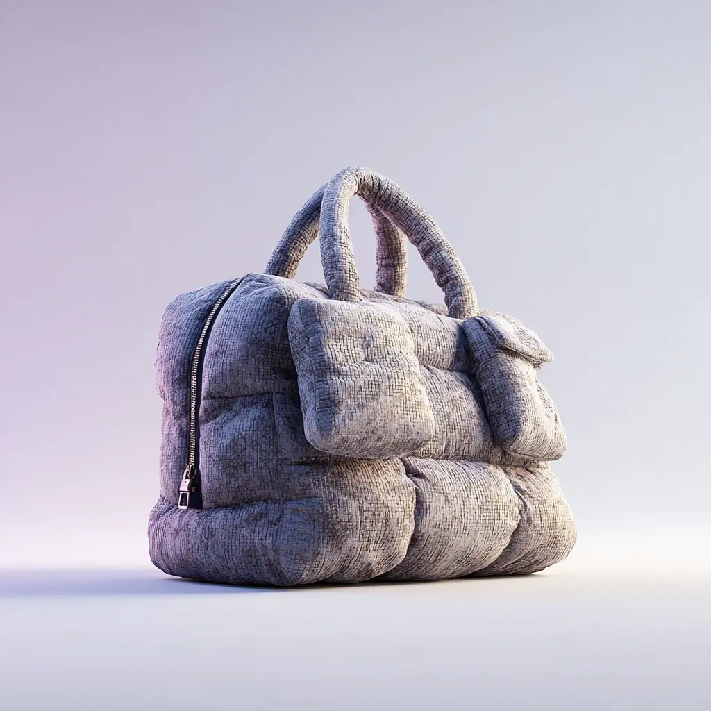
Plating Colours That Flatter Each Family
Hardware is where a neutral collection is won or lost, because plating is the only other reflective surface in the photograph and it sets the temperature of the whole image. The rule that holds across the four families is that warm neutrals want warm plating and cool neutrals want cool plating, with one deliberate exception available per collection.
| Colour family | Plating that flatters | Plating to avoid | Lining direction |
|---|---|---|---|
| Oat and bone | Light gold or brushed brass | Chrome; it reads clinical against cream | Mid-tone 190T, never matching pale |
| Clay and terracotta | Antique brass or light gold | Gunmetal; it kills the warmth | Toast or chocolate 68 gsm woven |
| Espresso and chocolate | Antique brass, or gunmetal for contrast | Chrome; it disappears into the body | Oat or camel for interior visibility |
| Olive and moss | Gunmetal or brushed nickel | Yellow gold; it fights the green | Charcoal 190T to avoid a muddy cast |
Corrosion testing belongs here too. A single zinc-alloy family in one plating colour, tested to ASTM B117 with 24 hours to first white corrosion, is the practical floor for a bag that will meet rain, hand lotion and a coastal warehouse. Where the plating is antique rather than bright, ask for the sealing step to be specified explicitly, because an unsealed antique finish is the most common source of marks on a light lining in the first month of ownership.
Building a Five-Colour Capsule for 2026
Five is the number that reads as a collection without multiplying dye lots: three families carried as core shades, one seasonal earth tone, one accent held on trim or lining. On a tote-led line that might look like oat, clay and espresso as core, olive as the seasonal addition, and a single accent lining across all five. That is four dye lots at 500 pcs each — 2,000 pieces — against a material buy that shares one hardware family and one lining colour, which is what keeps the unit price inside the target band.
- Pick the core three first. These carry 80 percent of the volume and are the shades that must be repeatable across seasons.
- Choose the seasonal shade second. One earth tone that changes annually keeps the line current without re-costing the core.
- Put the accent on trim. A lining, a zip tape colour or a puller dip is an accent that costs one lot rather than four.
- Fix one plating for the capsule. One bath, one colour, across zip, closure, D-rings and base studs.
- Freeze the swatch set. Physical, signed, dated, retained — the reference for every subsequent lot.
The capsule logic also protects the calendar. A five-colour plan agreed at brief stage means the material confirmation step takes 2-4 days rather than three weeks of swatch round-trips, and the 35-50 day bulk window starts on time. Where a shade is genuinely new to the line, build in one extra sampling cycle: sampling is 6-10 working days and a custom shade match typically needs one revision inside that window. The tote category economics show why the tote is usually the silhouette that carries a first capsule.
Briefing Colour So the Sample Matches the Run
The brief is short and it is entirely references: the Pantone TCX code or physical swatch for each colourway, the Delta E tolerance and light source, the gloss window for coated trim, the plating colour and ASTM B117 requirement, the minimum grades for ISO 105-B02 and ISO 105-X12, and the quantity per colourway. Send the physical swatch. Send a second one. A colour brief sent as a photograph on a phone is a colour brief that will be re-approved later at the cost of a sampling round.
Two closing habits. Approve colour under the lighting the customer will see it in, not under the lighting of the room where the sample arrived; a warm office lamp flatters clay and lies about olive. And approve the lining and the exterior together, because a pair that is individually correct can be jointly wrong — a common failure is an oat lining inside an espresso bag that tests at grade 3 on wet crocking and marks within a week.
For the silhouettes these shades land on, the leather handbag programme reference sets out how a capsule is costed across shared panels, and the boutique best-seller list shows which shapes carry a seasonal shade best on a shelf. The hobo silhouette note covers why soft shapes show colour differently from structured ones.
Trims Decide Whether a Neutral Holds Together
A neutral palette is held together or broken by four small components, and they are the ones a specification usually leaves to be chosen later. Thread, which should be tonal and stated by Tex. Zip tape, dyed to within one step of the body, because a black tape on an oat body reads as an accent. Binding, 12 mm and tonal, cut on the bias where it turns a curve. And the lining, which is the largest area of trim in the bag and the component most often substituted. A neutral held together by four tonal trims is a different product from the same shape with four stock ones.
- Thread. Tonal, Tex 40 bonded nylon at 7-9 stitches per inch with a 10 mm seam allowance.
- Zip tape. Dyed to within one step of the body colour, since a stock black tape is the commonest shortcut.
- Binding. 12 mm tonal and cut on the bias, which a straight-cut binding will not do around a curve.
- Lining. Named by denier and colour, 210D in a mid-tone, because it is the largest trim area in the bag.
How Each Family Ages Across a Season
Colour that matches on the day of approval and drifts within a season is a returns problem rather than a design one, and the four families age differently. Oat and bone soil at the handles and the base. Espresso burnishes at the corners and the strap fold, which is usually welcomed. Clay can fade under window light and needs a light fastness result before it is specified. Olive shifts towards grey under cool retail lighting, which is a photography problem as much as a dye one. Each family earns its own line on the care card.
| Family | Typical change | Test that predicts it |
|---|---|---|
| Oat and bone | Soiling at handles and base | ISO 105-X12 wet crocking, grade 3-4 |
| Clay and terracotta | Fading in window light | ISO 105-B02, blue wool 4 |
| Espresso and chocolate | Burnishing at corners | ISO 11640 rub, grey scale 4 |
| Olive and moss | Reads grey under cool light | Assessment under 4,000 K retail light |
Send a swatch, get a matched colour plan
Reply with your target shades, silhouettes and quantity per colourway, and post a physical swatch. A private label coordinator will return a matched colour plan with the Delta E tolerance, plating pairing and colourfastness grades written in — sampling at 6-10 working days, bulk at 35-50 days, inspection at AQL 2.5 under ISO 2859-1. Get a quote.
Frequently Asked Questions
Which neutral bag colours will sell best in 2026?
Four families carry the volume: oat and bone for resort and gifting, clay and terracotta for autumn drops, espresso and chocolate for work categories, and olive and moss for outdoor-adjacent and unisex lines. A capsule of three core families plus one seasonal earth tone reads as a collection rather than as four shades of beige.
How do I specify a bag colour so the production run matches the sample?
Give a Pantone TCX reference for fabric and coated material, a physical approved swatch for leather, a Delta E tolerance of 2.0 or better, and the light source — D65 for daylight plus the store lighting specification. Add a gloss window of 8-12 gloss units at 60 degrees for coated trim.
What Delta E tolerance should a handbag order specify?
Delta E 2.0 or better is the commercial standard: below 1.0 is invisible to most eyes, 2.0 to 3.5 is visible when two pieces sit side by side, and above 3.5 generates complaints. Specify 1.0 only where bags are sold together as a set, because it roughly doubles shade-matching time on a lot.
Why is the MOQ per colourway rather than per style?
Because each colourway is a separate dye or coating lot with its own production minimum, regardless of how many bags are cut from it. Two colours of one style is 1,000 pieces, not 500 split in half, and a second lot made months later will not be identical without an approved retained swatch.
Which colourfastness tests matter most for a handbag line?
Three: light fastness to ISO 105-B02 at grade 4 minimum, rubbing or crocking to ISO 105-X12 at 4-5 dry and 3-4 wet, and perspiration to ISO 105-E04 at grade 4 for straps and handles. Ask for them at material confirmation rather than at pre-shipment inspection.
What hardware plating suits oat and bone leather?
Light gold or brushed brass. Chrome reads clinical against cream and is the most common pairing mistake on pale neutrals. Olive and moss want gunmetal or brushed nickel, and clay is flattered by antique brass; avoid yellow gold on green, because it fights the undertone.
Why do pale neutral bags arrive with handling marks?
Pale exteriors and pale linings show every contact mark, and the usual cause is transit and store handling rather than wear. Specify a mid-tone 190T or 68 gsm lining instead of a matching pale one, ship with a dust bag as standard, and require an unsealed antique plating to be sealed explicitly.
Should colour be approved on a screen or on a physical swatch?
Always on a physical swatch, viewed under the lighting the customer will see. Approving on a screen is the most expensive habit in the trade and costs a full 6-10 working days of sampling round every time, because screens vary in white balance and leather finish changes perceived shade.
How many colours should a first capsule include?
Five: three core families, one seasonal earth tone and one accent carried on trim or lining rather than across the whole body. That is four dye lots at 500 pcs each, sharing one hardware family and one lining colour, which keeps the unit price inside the target band.
What causes batch drift on coated fabric colours?
Colourant addition is metered at roughly plus or minus 1.5 percent by weight on PU and PVC, and the band is where drift lives: at the top a clay reads orange, at the bottom it reads pink. On leather the equivalent variable is the finish rather than the dye.
How much gloss should coated trim have?
8-12 gloss units measured at 60 degrees. Outside that window a chemically correct colour still looks wrong to the eye, because the surface reflects differently and the brain reads the difference as a shade difference rather than as a sheen difference.
What should a colour brief contain?
The Pantone TCX code or physical swatch per colourway, the Delta E tolerance and light source, the gloss window for coated trim, the plating colour with an ASTM B117 corrosion requirement, minimum grades for ISO 105-B02 and ISO 105-X12, and the quantity per colourway. Send two physical swatches.
People Also Ask
Are earth tones still trending for 2026 collections?
They are carrying volume rather than trending, which is better. Clay, olive and espresso re-order across seasons, while saturated accents spike and then disappear from the reorder list.
Can one hardware plating work across a whole capsule?
Yes, and it should. One zinc-alloy family in one plating colour across zip, closure, D-rings and base studs keeps the plating bath to a single run and makes five colourways read as one collection.
Does olive read differently under retail lighting?
It does. Olive under 4000K LED reads grey, so specify the store lighting alongside D65 and approve the swatch under both before the bulk run is booked.
Is a darker emboss needed on espresso leather?
Yes. Espresso hides branding, so specify 0.6-0.9 mm of die depth rather than the 0.3-0.5 mm that reads correctly on oat, and consider a blind emboss plus a tonal foil.
Sources and further reading
Every figure on this page is either our own programme data or attributed below. Open the originals before you write them into a specification.
- REACH — chemical substances regulationEuropean Commission Annex XVII restricts the substances that may appear in finished leather and coatings.
- SATRA — technical services for leather, footwear and accessoriesSATRA Independent leather, hardware and accessories testing protocols.
- Leather Working Group — environmental auditing for tanneriesLeather Working Group Environmental audit protocol for tanneries and leather traceability.